A pandemic is wracking the globe. Racial unrest is wracking the U.S. I am wracking my memory trying to remember exactly what “wracking” means.
You know what we need? A brain break. A quick game, from @_b_p. So here we are:
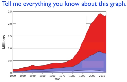
The title, you’ll notice, is missing. Something is growing over time, with an impressive boom around 1980, but we don’t know what.
Is it technological? Cultural? Demographic? Star Wars-related?
Think it over. Note the trends. Make a guess.
And then, when you’re ready, here’s the reveal.
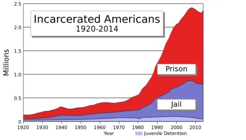
Okay, that’s an unhappy graph. My apologies.
And of course, as you lovable pedants may note, it doesn’t tell the whole story. What else changed in the U.S. during this time? What if we adjust for population? How does trend compare to other countries?
So let’s try another game, from Connie Rivera. This one unfolds a bit more slowly.

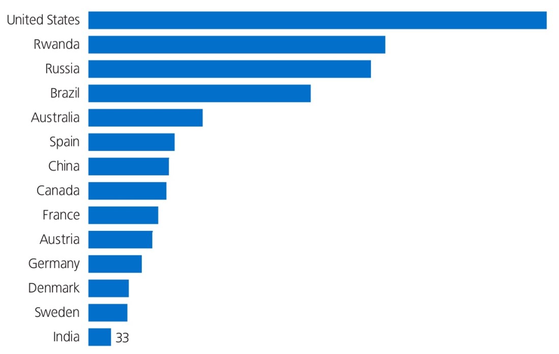
What might the bars represent? Number of monkeys petted? Price required to pet various kinds of monkeys? Calories expended in petting various kinds of monkeys?
Well, here’s your next clue:
Okay, so monkeys are maybe not the secret here.
What do the U.S., Rwanda, and Russia have in common? Yes, yes, a shared love of the TV show Friends. But that applies to all countries. Why would India and Sweden be so low? What’s going on here?
Another quick clue. It’s there at the bottom, if you don’t see it on first glance.
Hmm. For the 1.5-billion person nation of India, a total of just 33.
But 33 what?
Something is odd here, if a much smaller country like Spain or Canada can punch so far above its weight class.
Anyway, a good game within this game: can you eyeball the values of the other bars? If India is at 33, what’s Germany at?
Brazil?
The U.S.?
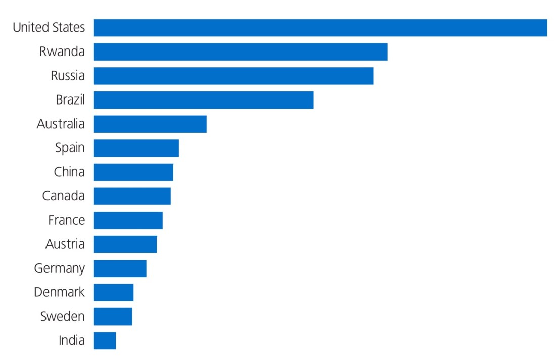
Ready or not, here they are:
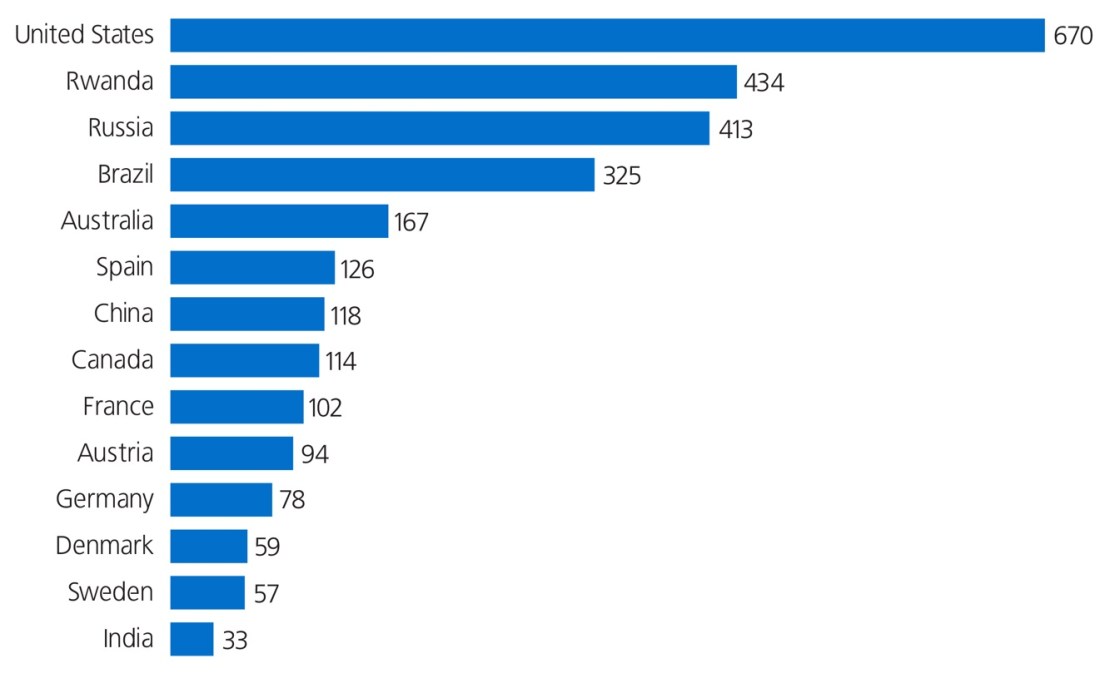
Wow! The U.S. is crushing India in this game, whatever it is. We’re beating them by a factor of 20. Take that, India!
And the game is…
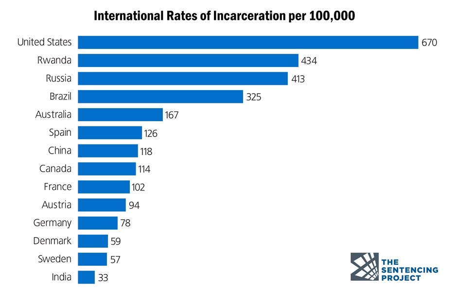
Drat. Another game we didn’t want to win.
These images come from Slow Reveal Graphs, a site run by leading elementary math educator Jenna Laib. She’s got dozens of these, organized as slideshows, ready to be employed in classrooms.
(Full disclosure: Jenna is my sister.)
(Even fuller disclosure: Jenna is a champion.)
The logic behind this exercise, as I understand it, is simple and powerful. Graphs tell stories. But stories unfold in time, whereas graphs just splatter you in the face, with all of the information at once.
So, hold back part of the story. Leave the reader in suspense. Let them notice, wonder, ask, speculate.
Then, and only then, deliver the full truth.

To read a graph requires a host of skills, from specific technical matters (where are the axes? how is quantity represented?) to broader, softer virtues (patience, attention, a sense of context). Slow Reveal Graphs help students build those skills.
And they’re fun, too.
I’ve seen Jenna run this instructional routine, and it’s magic. (I’ve run it myself, too – less magic, but still a blast.) Students have sharp eyes. They’ll catch things you missed, interpret features in ways you would never have guessed. They’ll build on each other, quibble with each other, learn from each other.
Perhaps best of all, there’s no shame in changing your mind.
Every kid does it, and it happens naturally. They predict. They watch new information come in. And then they update their predictions.
We humans are usually such stubborn and prideful creatures, clinging to our views long after they’ve melted into mud. But with Slow Reveal Graphs, suddenly we become astute Bayesians, updating our priors on the regular.
I encourage every teacher to check out the Slow Reveal Graphs site. Jenna has curated an admirable resource. (I’ve chosen two that are heavy as a bag of flour, but some are silly and fun!) And if right now isn’t a good time to bring a dose of truth to math lessons, then I sure don’t know when that time will come.
(Also: happy early birthday, Jenna!)

For a non-native speaker: What is the difference between Prison and Jail and is this an American distinction or throughout the english speaking world (eg does it apply in GB as well?)
“Jail” tends to be local and refers to where we hold people /before/ trial. “Prison” tends to be state-run and is where we hold people to serve out their time /after/ conviction. Though in actual use the two are often more-or-less interchangeable.
https://www.merriam-webster.com/words-at-play/jail-vs-prison-difference#:~:text=Jail%20and%20prison%20are%20often,convicted%20criminals%20of%20serious%20crimes.
Oddly enough, my brother (a defense attorney) and I were speaking this morning about the crime bill and the following mass incarceration. I saw that graph and almost immediately thought “boy, that looks like the boom in prison population.” I did not expect to be right, given the general tone of this website. I can’t say that I am happy to have been right, but I am glad that you are bringing attention to the issue.
Sorry to disrupt this serious conversation, but to the eyes of an innocent sixth-grader (me), it seemed like a graph about yearly consumption of chocolate.
This is a very nice post, and when I saw the videos of people being treated unequally based on race, it made me cry (and made me rethink my view of the US).
This is a great post on the power of the slow reveal graph routine and on Jenna’s website! One correction though… I think that graph on International Incarceration Rates was done by Connie Rivera. It’s part of a series of slow reveal graphs she created focused on racism and injustice within the criminal justice system. Melvin has created other slow reveal sequences on the site, including a post on ones he’s put up on Desmos that can be done asynchronously(!) during these covid times, and written about the language elements of the routine.
Ah, good catch – thanks for that, Mark!
Amazing idea, thank you!